Pensions
The triple lock cost, the replacement rate gap, and what the data actually says.
The Data Context
The UK state pension debate is dominated by two claims that rarely appear in the same sentence: that the triple lock is unaffordable, and that the UK state pension is ungenerous. Both are supported by the data. The triple lock has added £17–£23 per week above what single-index alternatives would have produced, costs an estimated £9–£12.6bn per year more than earnings-linked uprating, and is forecast to push state pension spending from 4.8% to up to 9% of GDP by the 2070s. At the same time, the UK state pension replaces only 22% of average earnings on its own — the lowest replacement rate in the G7. The honest picture requires holding both simultaneously.
What the Triple Lock Has Actually Added
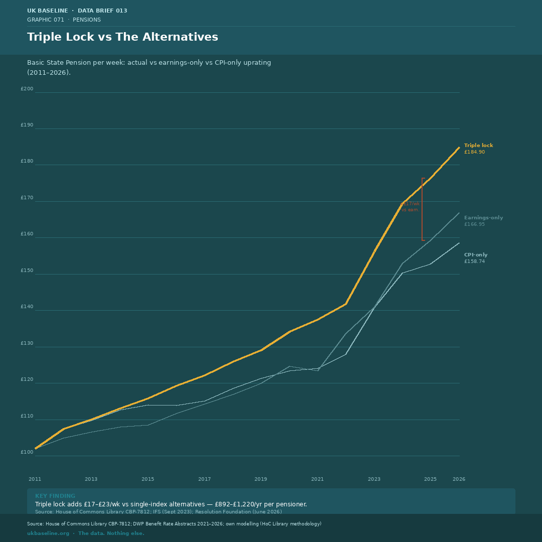
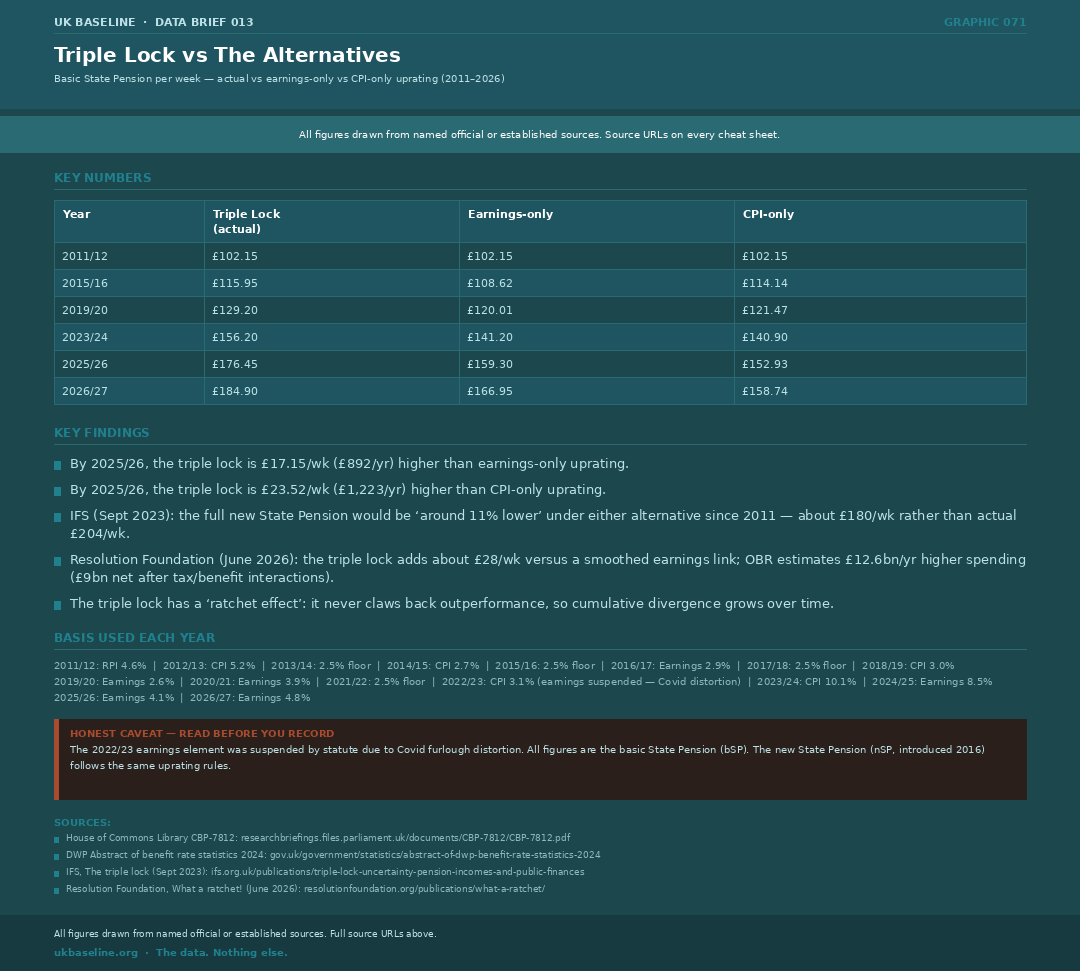
Since 2011, the triple lock has produced a basic State Pension of £176.45 per week in 2025/26. Under earnings-only uprating, it would be £159.30 — £17.15 less per week, or £892 per year. Under CPI-only, it would be £152.93 — £23.52 less per week, or £1,223 per year. The House of Commons Library confirmed the gap at 10.6–10.9% by 2023/24. The IFS puts the full new State Pension “around 11% lower” under either alternative since 2011.
- Triple lock mechanism: highest of CPI inflation, average earnings growth, or 2.5% — applied each April
- Introduced June 2010 Budget, first applied April 2011
- The 2.5% floor has been decisive in low-inflation years (2013/14, 2015/16, 2017/18, 2021/22)
- 2022/23: earnings element suspended by statute — Covid furlough data distorted the AWE figure
- Resolution Foundation (June 2026): OBR estimates spending would be £12.6bn/yr lower under earnings-linked uprating; net saving ~£9bn/yr after tax and means-tested benefit interactions
- The “ratchet effect”: the triple lock never claws back a year of outperformance. The gap compounds over time.
- Source: House of Commons Library CBP-7812; DWP Benefit Rate Abstracts; IFS; Resolution Foundation
Heading Toward a Post-War High
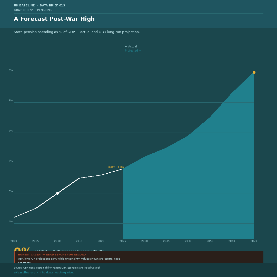
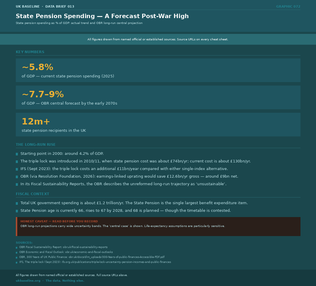
State pension spending is currently around 4.8% of GDP (OBR, 2025–26). The OBR's central projection has it reaching 7.7–9% of GDP by the early 2070s — exceeding any previous peacetime level. The OBR has described the long-run trajectory without reform as unsustainable, projecting public debt rising to around 270% of GDP by the 2070s if no action is taken (OBR March 2025; the July 2026 projection puts this figure higher still). State pension age is the principal lever: it rises to 67 by 2028, with 68 planned but the timetable repeatedly delayed by slower-than-expected life expectancy gains.
- State pension is the single largest benefit expenditure item — around £154bn/yr (2026)
- Triple lock adds ~£11–12.6bn/yr above what earnings-linked uprating would cost (IFS; OBR via Resolution Foundation)
- OBR long-run projection uses central demographic and economic assumptions — wide uncertainty bands apply
- Life expectancy growth has slowed since 2010, reducing pressure for pension age increases but also weakening the affordability case for sustaining the triple lock indefinitely
- State pension age: 66 now, 67 by 2028, 68 planned (earliest 2044, under review)
- Source: OBR Fiscal Sustainability Report; OBR Economic and Fiscal Outlook
The Lowest Replacement Rate in the G7
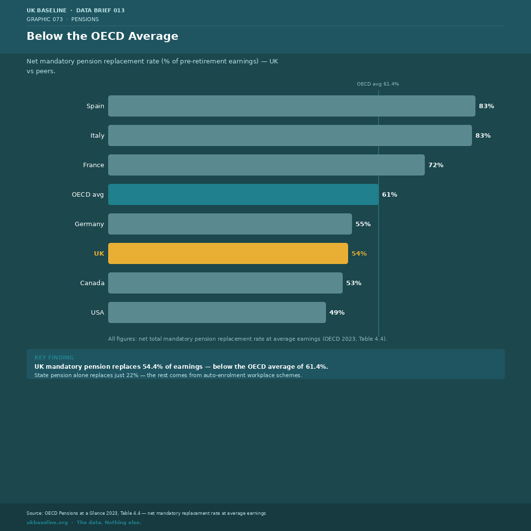
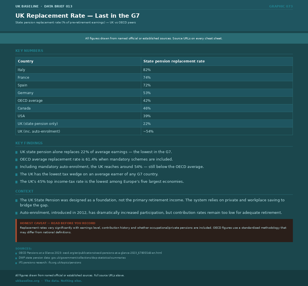
On a like-for-like basis — net total mandatory pension replacement rate at average earnings (OECD 2023, Table 4.4) — the UK reaches 54.4%, below the OECD average of 61.4%. The state pension alone replaces just 22% of earnings; the remainder comes from auto-enrolment workplace schemes. Italy reaches 82.6%, Spain 83.4%, France 71.9%, Germany 55.3%. The UK sits below the OECD average even when mandatory workplace pensions are included.
- OECD methodology uses a standardised earnings base (average worker) and mandatory scheme rules only — private voluntary saving excluded
- UK figure of 22% is state pension only; the ~54% including auto-enrolment assumes contributions are sufficient (many are not — see Graphic 076)
- UK has the lowest tax wedge on an average earner of any G7 country
- UK's 45% top income tax rate is the lowest among Europe's five largest economies
- The UK state pension was designed as a foundation, not a primary retirement income — the assumption being that occupational/private saving would bridge the gap
- Source: OECD Pensions at a Glance 2023
The Triple Lock Did Not Reduce Pensioner Poverty
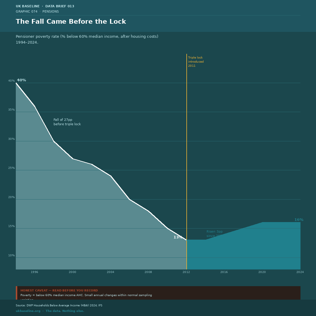
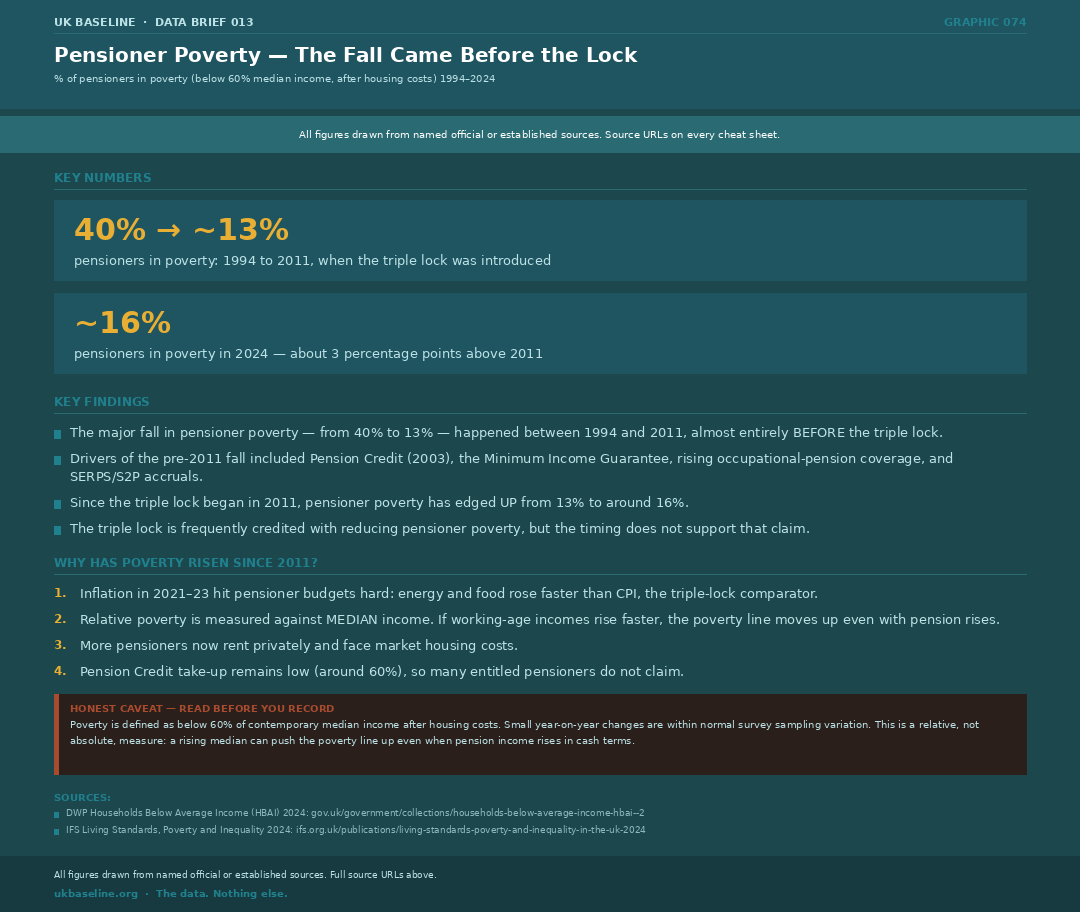
Pensioner poverty fell from 28% in 1994–95 to 13% in 2011–12 — a reduction of around 15 percentage points (DWP HBAI, after housing costs). The triple lock was introduced in 2011. Since then, pensioner poverty has edged up to around 16%. The policy is frequently credited with the reduction in pensioner poverty, but the data shows the fall came almost entirely before the lock was introduced.
- Pre-2011 drivers of the poverty fall: Pension Credit (2003), Minimum Income Guarantee, rising occupational pension coverage, SERPS/S2P accrual
- Since 2011: pensioner poverty has risen ~3pp despite the triple lock
- Why has it risen since 2011? Four factors: (1) Inflation 2021–23 hit energy and food harder than headline CPI; (2) relative poverty measure moves with median income — if working-age incomes rise faster, the threshold rises too; (3) more pensioners in private rented sector facing market rents; (4) Pension Credit take-up remains around 60% — many entitled pensioners do not claim
- The triple lock has undoubtedly protected pension income in cash terms — but poverty is a relative measure and the policy has not succeeded in pushing pensioner poverty back to its 2011 low
- Source: DWP Households Below Average Income (HBAI) 2024; IFS
The Wealthiest Household Cohort
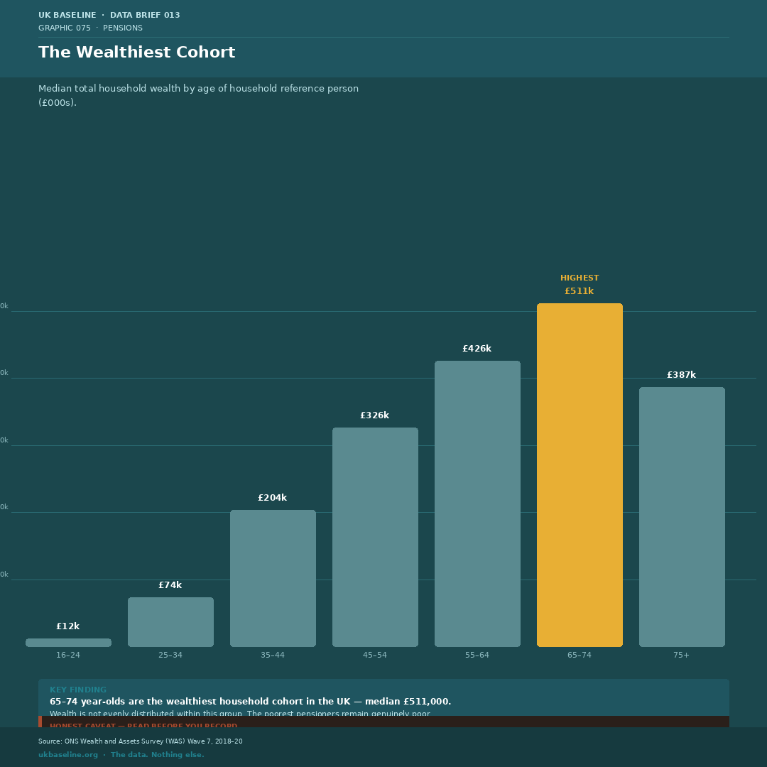
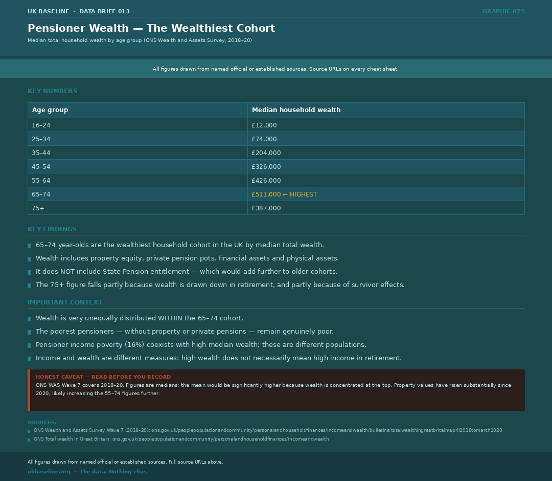
Older households hold substantially more wealth than younger cohorts. The ONS Wealth and Assets Survey 2018–20 shows the highest median wealth in the cohort approaching and just above State Pension age. Figures for specific 65–74 and 75+ age bands are drawn from the underlying WAS dataset. This includes property equity, private pension pots, financial assets, and physical assets — but not state pension entitlement. The 75+ cohort has lower median wealth partly through drawdown and partly through survivor effects.
- Median wealth peaks at 65–74 then falls — retirement wealth drawdown and mortality selection
- Wealth is very unequally distributed within the 65–74 cohort: high median coexists with genuine poverty among those without property or private pensions
- Pensioner income poverty (16%) and high median wealth are not contradictory — they describe different populations within the same age group
- Property wealth accounts for a large share: homeownership rates are much higher among older cohorts
- Since 2020, house price growth will have widened this cohort's lead further
- Source: ONS Wealth and Assets Survey Wave 7, 2018–20
Auto-Enrolled But Not Saving Enough
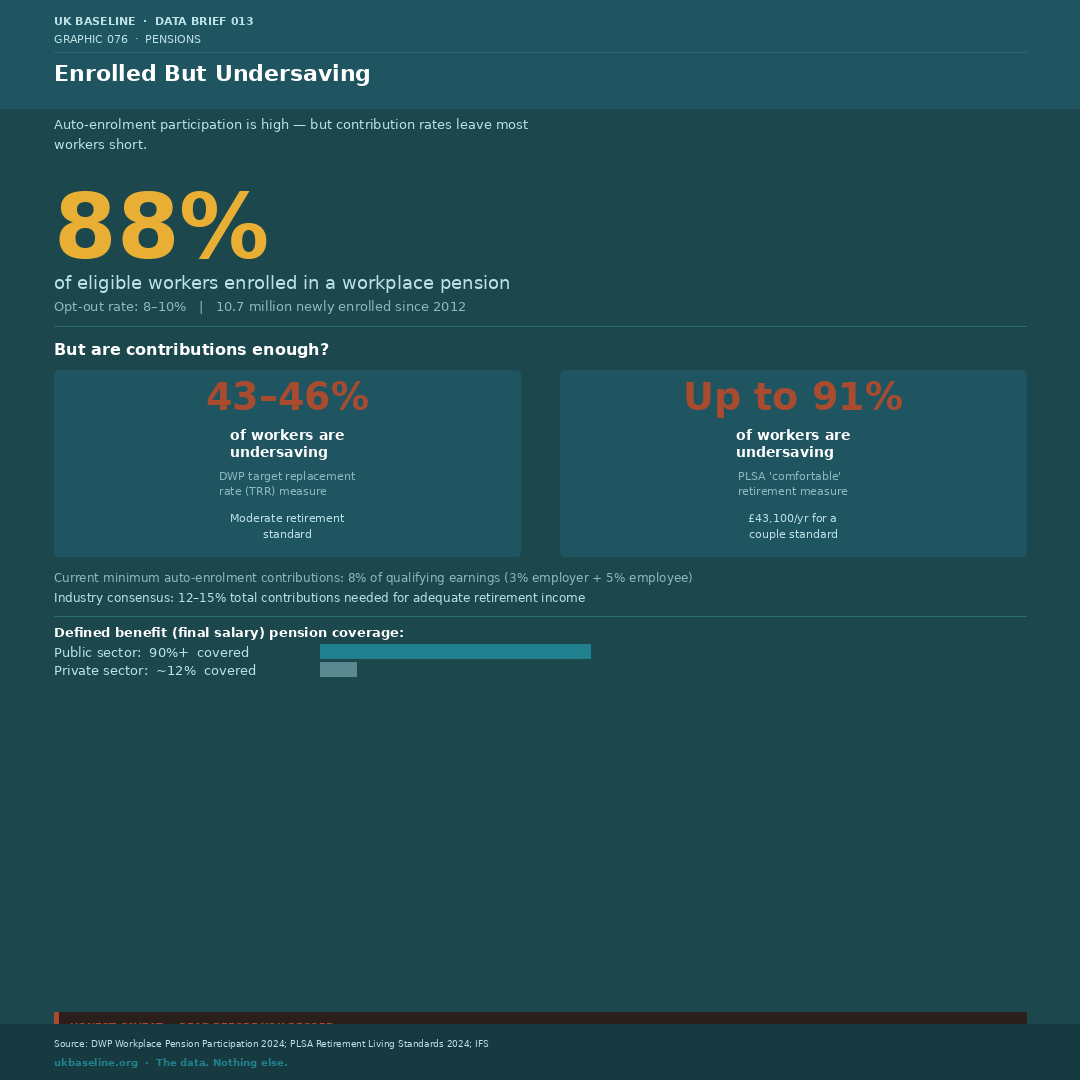
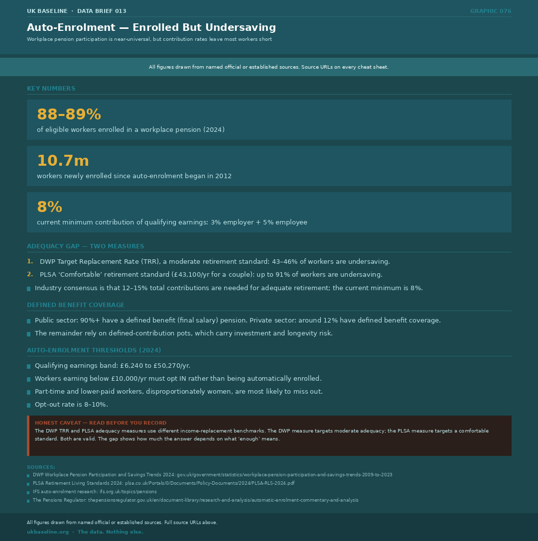
Auto-enrolment has achieved near-universal workplace pension participation — 88% of eligible workers are enrolled, with only an 8–10% opt-out rate. But participation is not the same as adequacy. DWP's own measure finds 43–46% of workers are undersaving for a moderate retirement. On the PLSA's comfortable retirement standard (£59,000/year for a couple, £43,100 for a single person), up to 91% are below target. The current minimum contribution rate of 8% of qualifying earnings is broadly agreed to be insufficient.
- Auto-enrolment began 2012; 10.7 million workers newly enrolled since launch
- Current minimum: 3% employer + 5% employee = 8% of qualifying earnings (£6,240–£50,270)
- Industry consensus for adequate retirement: 12–15% total contributions
- Workers earning under £10,000/yr must opt in — not automatically enrolled; disproportionately affects part-time and lower-paid workers, the majority of whom are women
- Defined benefit (final salary) pension coverage: public sector 90%+, private sector ~12% — a stark generational and sectoral divide
- Two adequacy benchmarks deliberately included: DWP TRR (moderate) and PLSA (comfortable). Neither is wrong — they measure different ambitions. The gap shows how much “enough” depends on the standard chosen.
- Source: DWP Workplace Pension Participation and Savings Trends 2024; PLSA Retirement Living Standards 2024; IFS
Read Before You Record
The headline numbers are robust, but their definition and denominator matter. Keep these three qualifications with any retelling of the brief.
- The triple lock comparison figures are for the basic State Pension (bSP). The new State Pension (nSP, introduced April 2016 at £155.65/week) follows the same uprating rules. The IFS figure of “11% lower” applies to the full new State Pension and traces the shadow value from 2011, not just from 2016. Always specify which pension you are citing.
- Pensioner poverty figures use a relative measure — below 60% of contemporary median income after housing costs. A rising median income can push the poverty line up even when pension incomes rise in cash terms. This is not a flaw in the measure — it is what relative poverty is designed to capture. Always state which measure you are using.
- Wealth and income are different things. A household with significant wealth (mostly housing) may have a modest retirement income. Do not conflate high median wealth with high income security.
Sources
The full source list below links to the underlying official data and supporting analysis used in this brief.
- House of Commons Library, State Pension triple lock (CBP-7812)
- DWP Abstract of benefit rate statistics 2024
- IFS, The triple lock: uncertainty for pension incomes and the public finances (September 2023)
- Resolution Foundation, What a ratchet! (June 2026)
- OBR Fiscal Sustainability Report
- OBR Economic and Fiscal Outlook
- OBR, 300 Years of UK Public Finance
- OECD Pensions at a Glance 2023
- DWP Households Below Average Income (HBAI) 2024
- IFS Living Standards, Poverty and Inequality 2024
- ONS Wealth and Assets Survey Wave 7 (2018–20)
- DWP Workplace Pension Participation and Savings Trends 2024
- PLSA Retirement Living Standards 2024